Hello Test(hexo-butterfly-tag-plugins-plus)
This is Tab 1.
This is Tab 2.
This is Tab 3.
This is Tab 4.
This is Tab 5.
1.行内文本样式 text
1 | {% u 文本内容 %} |
- 带 下划线 的文本
- 带
着重号 的文本 - 带
波浪线 的文本 - 带
删除线的文本 - 键盘样式的文本 command + D
- 密码样式的文本:
这里没有验证码
1 | 1. 带 {% u 下划线 %} 的文本 |
2.行内文本 span
1 | {% span 样式参数(参数以空格划分), 文本内容 %} |
- 字体: logo, code
- 颜色: red,yellow,green,cyan,blue,gray
- 大小: small, h4, h3, h2, h1, large, huge, ultra
- 对齐方向: left, center, right
- 彩色文字 在一段话中方便插入各种颜色的标签,包括:红色、黄色、绿色、青色、蓝色、灰色。
- 超大号文字 文档「开始」页面中的标题部分就是超大号文字。 Volantis A Wonderful Theme for Hexo
1 | - 彩色文字 |
3.段落文本 p
1 | {% p 样式参数(参数以空格划分), 文本内容 %} |
- 字体: logo, code
- 颜色: red,yellow,green,cyan,blue,gray
- 大小: small, h4, h3, h2, h1, large, huge, ultra
- 对齐方向: left, center, right
- 彩色文字 在一段话中方便插入各种颜色的标签,包括:
红色
、黄色
、绿色
、青色
、蓝色
、灰色
。 - 超大号文字 文档「开始」页面中的标题部分就是超大号文字。
Volantis
A Wonderful Theme for Hexo
1 | - 彩色文字 |
4.上标标签 tip
1 | {% tip [参数,可选] %}文本内容{% endtip %} |
- 样式: success,error,warning,bolt,ban,home,sync,cogs,key,bell
- 自定义图标: 支持fontawesome。
default
info
success
error
warning
bolt
ban
home
sync
cogs
key
bell
自定义font awesome图标
1 | {% tip %}default{% endtip %} |
5.动态标签 anima
6.复选列表 checkbox
1 | {% checkbox 样式参数(可选), 文本(支持简单md) %} |
- 样式: plus, minus, times
- 颜色: red,yellow,green,cyan,blue,gray
- 选中状态: checked
This is Tab 3.
1 | {% checkbox 纯文本测试 %} |
纯文本测试
支持简单的 markdown 语法
支持自定义颜色
绿色 + 默认选中
黄色 + 默认选中
青色 + 默认选中
蓝色 + 默认选中
增加
减少
叉
7.单选列表 radio
1 | {% radio 样式参数(可选), 文本(支持简单md) %} |
- 颜色: red,yellow,green,cyan,blue,gray
- 选中状态: checked
This is Tab 3.
1 | {% radio 纯文本测试 %} |
纯文本测试
支持简单的 markdown 语法
支持自定义颜色
绿色
黄色
青色
蓝色
8.时间轴 timeline
1 | {% timeline 时间线标题(可选)[,color] %} |
- title: 标题/时间线
- color:
timeline颜色:default(留空) / blue / pink / red / purple / orange / green
时间轴样式
2020-07-24 2.6.6 -> 3.0
-
如果有
hexo-lazyload-image插件,需要删除并重新安装最新版本,设置lazyload.isSPA: true。 -
2.x 版本的 css 和 js 不适用于 3.x 版本,如果使用了
use_cdn: true则需要删除。 - 2.x 版本的 fancybox 标签在 3.x 版本中被重命名为 gallery 。
-
2.x 版本的置顶
top: true改为了pin: true,并且同样适用于layout: page的页面。 -
如果使用了
hexo-offline插件,建议卸载,3.0 版本默认开启了 pjax 服务。
2020-05-15 2.6.3 -> 2.6.6
不需要额外处理。
2020-04-20 2.6.2 -> 2.6.3
-
全局搜索
seotitle并替换为seo_title。 -
group 组件的索引规则有变,使用 group 组件的文章内,
group: group_name对应的组件名必须是group_name。 -
group 组件的列表名优先显示文章的
short_title其次是title。
1 | {% timeline 时间轴样式,blue %} |
9.链接卡片 link
1 | {% link 标题, 链接, 图片链接(可选) %} |

1 | {% link 糖果屋教程贴, https://akilar.top/posts/615e2dec/, /img/siteicon/favicon.ico %} |
10.按钮 btns
1 | {% btns 样式参数 %} |
- 圆角样式:rounded, circle
- 增加文字样式:可以在容器内增加
<b>标题</b>和<p>描述文字</p> - 布局方式:
默认为自动宽度,适合视野内只有一两个的情况。
| 参数 | 含义 |
|---|---|
| wide | 宽一点的按钮 |
| fill | 填充布局,自动铺满至少一行,多了会换行 |
| center | 居中,按钮之间是固定间距 |
| around | 居中分散 |
| grid2 | 等宽最多2列,屏幕变窄会适当减少列数 |
| grid3 | 等宽最多3列,屏幕变窄会适当减少列数 |
| grid4 | 等宽最多4列,屏幕变窄会适当减少列数 |
| grid5 | 等宽最多5列,屏幕变窄会适当减少列数 |
This is Tab 3.
- 如果需要显示类似「团队成员」之类的一组含有头像的链接:
1
2
3
4
5
6
7{% btns circle grid5 %}
{% cell xaoxuu, https://xaoxuu.com, https://cdn.jsdelivr.net/gh/xaoxuu/cdn-assets/avatar/avatar.png %}
{% cell xaoxuu, https://xaoxuu.com, https://cdn.jsdelivr.net/gh/xaoxuu/cdn-assets/avatar/avatar.png %}
{% cell xaoxuu, https://xaoxuu.com, https://cdn.jsdelivr.net/gh/xaoxuu/cdn-assets/avatar/avatar.png %}
{% cell xaoxuu, https://xaoxuu.com, https://cdn.jsdelivr.net/gh/xaoxuu/cdn-assets/avatar/avatar.png %}
{% cell xaoxuu, https://xaoxuu.com, https://cdn.jsdelivr.net/gh/xaoxuu/cdn-assets/avatar/avatar.png %}
{% endbtns %} - 或者含有图标的按钮:
1
2
3
4{% btns rounded grid5 %}
{% cell 下载源码, /, fas fa-download %}
{% cell 查看文档, /, fas fa-book-open %}
{% endbtns %} - 圆形图标 + 标题 + 描述 + 图片 + 网格5列 + 居中
1
2
3
4
5
6
7
8
9
10
11
12
13
14{% btns circle center grid5 %}
<a href='https://apps.apple.com/cn/app/heart-mate-pro-hrm-utility/id1463348922?ls=1'>
<i class='fab fa-apple'></i>
<b>心率管家</b>
{% p red, 专业版 %}
<img src='https://cdn.jsdelivr.net/gh/xaoxuu/cdn-assets/qrcode/heartmate_pro.png'>
</a>
<a href='https://apps.apple.com/cn/app/heart-mate-lite-hrm-utility/id1475747930?ls=1'>
<i class='fab fa-apple'></i>
<b>心率管家</b>
{% p green, 免费版 %}
<img src='https://cdn.jsdelivr.net/gh/xaoxuu/cdn-assets/qrcode/heartmate_lite.png'>
</a>
{% endbtns %}
- 如果需要显示类似「团队成员」之类的一组含有头像的链接:
- 或者含有图标的按钮:
- 圆形图标 + 标题 + 描述 + 图片 + 网格5列 + 居中
 xaoxuu

11.github卡片 ghcard
1 | {% ghcard 用户名, 其它参数(可选) %} |
更多参数可以参考:
使用,分割各个参数。写法为:参数名=参数值
以下只写几个常用参数值。
| 参数名 | 取值 | 释义 |
|---|---|---|
| hide | stars,commits,prs,issues,contribs | 隐藏指定统计 |
| count_private | true | 将私人项目贡献添加到总提交计数中 |
| show_icons | true | 显示图标 |
| theme | 请查阅Available Themes | 主题 |
This is Tab 3.
- 用户信息卡片
1
2
3
4
5| {% ghcard xaoxuu %} | {% ghcard xaoxuu, theme=vue %} |
| -- | -- |
| {% ghcard xaoxuu, theme=buefy %} | {% ghcard xaoxuu, theme=solarized-light %} |
| {% ghcard xaoxuu, theme=onedark %} | {% ghcard xaoxuu, theme=solarized-dark %} |
| {% ghcard xaoxuu, theme=algolia %} | {% ghcard xaoxuu, theme=calm %} | - 仓库信息卡片
1
2
3
4
5| {% ghcard volantis-x/hexo-theme-volantis %} | {% ghcard volantis-x/hexo-theme-volantis, theme=vue %} |
| -- | -- |
| {% ghcard volantis-x/hexo-theme-volantis, theme=buefy %} | {% ghcard volantis-x/hexo-theme-volantis, theme=solarized-light %} |
| {% ghcard volantis-x/hexo-theme-volantis, theme=onedark %} | {% ghcard volantis-x/hexo-theme-volantis, theme=solarized-dark %} |
| {% ghcard volantis-x/hexo-theme-volantis, theme=algolia %} | {% ghcard volantis-x/hexo-theme-volantis, theme=calm %} |
- 用户信息卡片
- 仓库信息卡片
12.github徽标 ghbdage
1 | {% bdage [right],[left],[logo]||[color],[link],[title]||[option] %} |
left:徽标左边的信息,必选参数。right:徽标右边的信息,必选参数。logo:徽标图标,图标名称详见simpleicons,可选参数。color:徽标右边的颜色,可选参数。link:指向的链接,可选参数。title:徽标的额外信息,可选参数。主要用于优化SEO,但object标签不会像a标签一样在鼠标悬停时显示title信息。option:自定义参数,支持<shields.io>的全部API参数支持,具体参数可以参看上文中的拓展写法示例。形式为name1=value2&name2=value2。
本外挂标签的参数分为三组,用||分割。
- 基本参数,定义徽标左右文字和图标
- 信息参数,定义徽标右侧内容背景色,指向链接
//如果是跨顺序省略可选参数,仍然需要写个逗号,用作分割
- 拓展参数,支持shields的API的全部参数内容
//如果是跨顺序省略可选参数组,仍然需要写双竖线||用作分割
本外挂标签的参数分为三组,用||分割。
- 基本参数,定义徽标左右文字和图标
1
2{% bdage Theme,Butterfly %}
{% bdage Frame,Hexo,hexo %} - 信息参数,定义徽标右侧内容背景色,指向链接
1
2
3{% bdage CDN,JsDelivr,jsDelivr||abcdef,https://metroui.org.ua/index.html,本站使用JsDelivr为静态资源提供CDN加速 %}
//如果是跨顺序省略可选参数,仍然需要写个逗号,用作分割
{% bdage Source,GitHub,GitHub||,https://github.com/ %} - 拓展参数,支持shields的API的全部参数内容
1
2
3{% bdage Hosted,Vercel,Vercel||brightgreen,https://vercel.com/,本站采用双线部署,默认线路托管于Vercel||style=social&logoWidth=20 %}
//如果是跨顺序省略可选参数组,仍然需要写双竖线||用作分割
{% bdage Hosted,Vercel,Vercel||||style=social&logoWidth=20&logoColor=violet %}
13.网站卡片 sites
14.行内图片 inlineimage
1 | {% inlineimage 图片链接, height=高度(可选) %} |
- 高度:height=20px
This is Tab 3.
1 | 这是{% inlineimage https://cdn.jsdelivr.net/gh/volantis-x/cdn-emoji/aru-l/0000.gif %}一段话。 |
这是 一段话。
一段话。
这又是 一段话。
一段话。
15.音频 audio
1 | {% audio 音频链接 %} |
This is Tab 3.
1 | {% audio https://github.com/volantis-x/volantis-docs/releases/download/assets/Lumia1020.mp3 %} |
16.视频 video
1 | {% video 视频链接 %} |
- 对其方向:left, center, right
- 列数:逗号后面直接写列数,支持 1 ~ 4 列。
This is Tab 3.
- 100%宽度
1
{% video https://github.com/volantis-x/volantis-docs/releases/download/assets/IMG_0341.mov %}
- 50%宽度
1
2
3
4
5
6{% videos, 2 %}
{% video https://github.com/volantis-x/volantis-docs/releases/download/assets/IMG_0341.mov %}
{% video https://github.com/volantis-x/volantis-docs/releases/download/assets/IMG_0341.mov %}
{% video https://github.com/volantis-x/volantis-docs/releases/download/assets/IMG_0341.mov %}
{% video https://github.com/volantis-x/volantis-docs/releases/download/assets/IMG_0341.mov %}
{% endvideos %} - 25%宽度
1
2
3
4
5
6
7
8
9
10{% videos, 4 %}
{% video https://github.com/volantis-x/volantis-docs/releases/download/assets/IMG_0341.mov %}
{% video https://github.com/volantis-x/volantis-docs/releases/download/assets/IMG_0341.mov %}
{% video https://github.com/volantis-x/volantis-docs/releases/download/assets/IMG_0341.mov %}
{% video https://github.com/volantis-x/volantis-docs/releases/download/assets/IMG_0341.mov %}
{% video https://github.com/volantis-x/volantis-docs/releases/download/assets/IMG_0341.mov %}
{% video https://github.com/volantis-x/volantis-docs/releases/download/assets/IMG_0341.mov %}
{% video https://github.com/volantis-x/volantis-docs/releases/download/assets/IMG_0341.mov %}
{% video https://github.com/volantis-x/volantis-docs/releases/download/assets/IMG_0341.mov %}
{% endvideos %}
- 100%宽度
- 25%宽度
17.折叠框 folding
1 | {% folding 参数(可选), 标题 %} |
- 颜色:blue, cyan, green, yellow, red
- 状态:状态填写 open 代表默认打开。
This is Tab 3.
1 | {% folding 查看图片测试 %} |
查看图片测试

查看默认打开的折叠框
这是一个默认打开的折叠框。
查看代码测试
假装这里有代码块(代码块没法嵌套代码块)
查看列表测试
- haha
- hehe
查看嵌套测试1
查看嵌套测试2
<div class='content'>
<details class="folding-tag" green><summary>查看嵌套测试3</summary><pre><code> <div class='content'> <p>hahaha<span><img src='https://cdn.jsdelivr.net/gh/volantis-x/cdn-emoji/tieba/%E6%BB%91%E7%A8%BD.png' style='height:24px'></span></p> </div> </details></code></pre>
</div>
</details>查看嵌套测试4
hahaha

18.数据集合 issues
19.诗词标签 poem
1 | {% poem [title],[author] %} |
- title:诗词标题
- author:作者,可以不写
This is Tab 3.
1 | {% poem 水调歌头,苏轼 %} |
丙辰中秋,欢饮达旦,大醉,作此篇,兼怀子由。
明月几时有?把酒问青天。
不知天上宫阙,今夕是何年?
我欲乘风归去,又恐琼楼玉宇,高处不胜寒。
起舞弄清影,何似在人间?
转朱阁,低绮户,照无眠。
不应有恨,何事长向别时圆?
人有悲欢离合,月有阴晴圆缺,此事古难全。
但愿人长久,千里共婵娟。
20.阿里图标 icon
1 | {% icon [icon-xxxx],[font-size] %} |
icon-xxxx:表示图标font-class,可以在自己的阿里矢量图标库项目的font-class引用方案内查询并复制。font-size:表示图标大小,直接填写数字即可,单位为em。图标大小默认值为1em。
This is Tab 3.
1 | {% icon icon-rat_zi %}{% icon icon-rat,2 %} |
21.特效标签 wow
22.进度条 progress
1 | {% progress [width] [color] [text] %} |
width:0到100的阿拉伯数字color:颜色,取值有red,yellow,green,cyan,blue,graytext:进度条上的文字内容
1 | {% progress 10 red 进度条样式预览 %} |
23.气泡注释 bubble
1 | {% bubble [content] , [notation] ,[background-color] %} |
content: 注释词汇notation: 悬停显示的注解内容background-color: 可选,气泡背景色。默认为“#71a4e3”
This is Tab 3.
1 | 最近我学到了不少新玩意儿(虽然对很多大佬来说这些已经是旧技术了),比如CSS的{% bubble 兄弟相邻选择器,"例如 h1 + p {margin-top:50px;}" %},{% bubble flex布局,"Flex 是 Flexible Box 的缩写,意为"弹性布局",用来为盒状模型提供最大的灵活性","#ec5830" %},{% bubble transform变换,"transform 属性向元素应用 2D 或 3D 转换。该属性允许我们对元素进行旋转、缩放、移动或倾斜。","#1db675" %},animation的{% bubble 贝塞尔速度曲线,"贝塞尔曲线(Bézier curve),又称贝兹曲线或贝济埃曲线,是应用于二维图形应用程序的数学曲线。一般的矢量图形软件通过它来精确画出曲线,贝兹曲线由线段与节点组成,节点是可拖动的支点,线段像可伸缩的皮筋","#de4489" %}写法,还有今天刚看到的{% bubble clip-path,"clip-path属性使用裁剪方式创建元素的可显示区域。区域内的部分显示,区域外的隐藏。","#868fd7" %}属性。这些对我来说很新颖的概念狠狠的冲击着我以前积累起来的设计思路。 |
最近我学到了不少新玩意儿(虽然对很多大佬来说这些已经是旧技术了),比如CSS的兄弟相邻选择器例如 h1 + p {margin-top:50px;},flex布局Flex 是 Flexible Box 的缩写,意为弹性布局",用来为盒状模型提供最大的灵活性",transform变换transform 属性向元素应用 2D 或 3D 转换。该属性允许我们对元素进行旋转、缩放、移动或倾斜。,animation的贝塞尔速度曲线贝塞尔曲线(Bézier curve),又称贝兹曲线或贝济埃曲线,是应用于二维图形应用程序的数学曲线。一般的矢量图形软件通过它来精确画出曲线,贝兹曲线由线段与节点组成,节点是可拖动的支点,线段像可伸缩的皮筋写法,还有今天刚看到的clip-pathclip-path属性使用裁剪方式创建元素的可显示区域。区域内的部分显示,区域外的隐藏。属性。这些对我来说很新颖的概念狠狠的冲击着我以前积累起来的设计思路。
24.引用文献 reference
1 | {% referto [id] , [literature] %} |
考虑到锚点跳转的特性,不建议您将引用出处标签referfrom写在常隐外挂标签(如folding、tab、hideToggle)中,这样能有效避免跳转失败。
- referto
引用上标
id:上标序号内容,需与referfrom标签的id对应才能实现跳转literature:引用的参考文献名称 - referfrom
引用出处
id:序号内容,需与referto标签的id对应才能实现跳转literature:引用的参考文献名称url:引用的参考文献链接,可省略
Akilarの糖果屋(akilar.top)是一个私人性质的博客[1]Akilarの糖果屋群聊简介参考资料,从各类教程至生活点滴,无话不谈。建群的目的是提供一个闲聊的场所。博客采用Hexo框架[2]Hexo中文文档参考资料,Butterfly主题[3]Butterfly 安装文档(一) 快速开始参考资料
本项目参考了Volantis[4]hexo-theme-volantis 标签插件参考资料的标签样式。引入[tag].js,并针对butterfly主题修改了相应的[tag].styl。在此鸣谢Volantis主题众开发者。
主要参考内容包括各个volantis的内置标签插件文档[5]Volantis文档:内置标签插件参考资料
Butterfly主题的各个衍生魔改[6]Butterfly 安装文档:标签外挂(Tag
Plugins参考资料[7]小弋の生活馆全样式预览参考资料[8]l-lin-font-awesome-animation参考资料[9]小康的butterfly主题使用文档参考资料
1 | Akilarの糖果屋(akilar.top)是一个私人性质的博客{% referto '[1]','Akilarの糖果屋群聊简介' %},从各类教程至生活点滴,无话不谈。建群的目的是提供一个闲聊的场所。博客采用Hexo框架{% referto '[2]','Hexo中文文档' %},Butterfly主题{% referto '[3]','Butterfly 安装文档(一) 快速开始' %} |
25.旋转相册 carousel
1 | {% carousel [Id] , [name] %} |
Id:相册唯一ID,用于监测相册鼠标动作。禁止使用中文。同一页内不得出现相同ID的carousel相册。name:相册中间显示的内容,建议用英文单引号包裹。

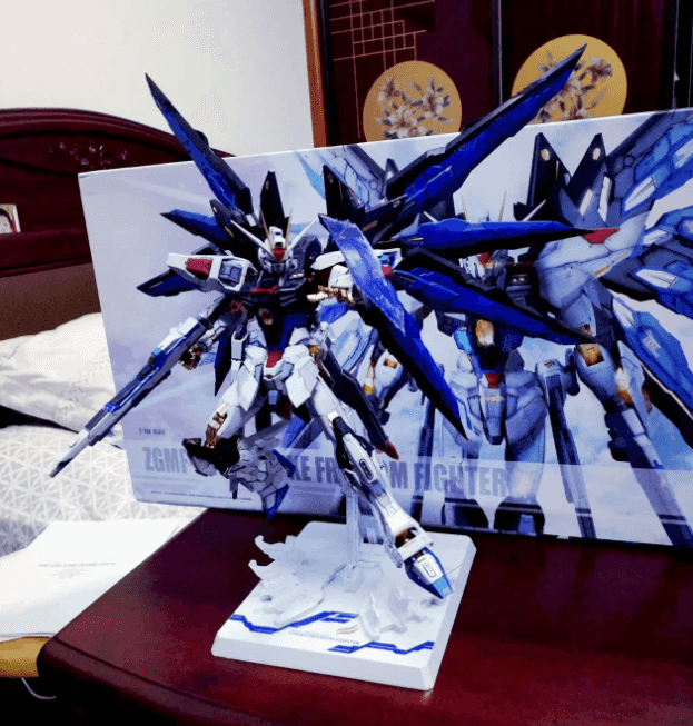


strike freedom
1 | {% carousel 'SF','strike freedom' %} |
26.引用 note
27.单张图片 image
28.相册 gallery
29.分栏 tab
[up主专用,视频内嵌代码贴在这]